Stats Page
The stats page
Our stats page has a lot of information, and at first, it may look like a lot to unpack. But don't be overwhelmed, this article will go over everything you need to know!
Let's start at the beginning.
Your stats VS global stats
You may have noticed that there are two tabs. One labeled "Your stats" and one labeled "Global stats". The global stats show the profit and loss data, based on the exchange you are on, and the quote currency you have chosen.

For now, Let’s focus on “Your stats”.
Graphs and numbers
There are a lot of graphs, numbers and charts on this page. We will go over each one and what they are trying to tell you.
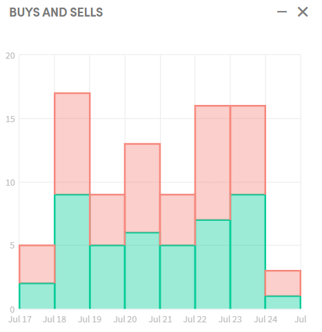
Buys and sells
The buys and sells graph shows you a comparison of the buys versus the sells. The bar between July 20th and July 21st shows more sells than buys.
Allocation of funds
This handy graph shows the make-up of your portfolio! Pro-tip: Hover over this chart to see what is allocated in open positions and what is left to invest.

Profit Stats
The profit stats provide a quick overview of how your trading is going. This is hands-down the best gauge for profit-tracking. It shows you the Investment made, the returns and the current profit / loss in open positions. Because this picture was taken on a paper trader, no fees are shown.

Profits based on sell triggers
In this chart, you can see which triggers caused you the most profit or loss. In this case, there have been 44 sells with an average profit of 2.3%. Not bad!

Profits based on buy triggers
This chart will show where your hopper has been buying from. Either through strategy, signals, DCA, or any other feature you use on Cryptohopper!

Daily profits The daily profits chart shows how much you have been making daily, percentage wise. As you can see in this graph, there hasn't been a negative day in a full week, which is very nice.

Average Holding Times
The average holding times schematic shows you how long you have been holding coins for (on average). As you can see here, there are a few coins that are bought and sold within the hour!

Average profits per coin
This chart is fairly self-explanatory. Keep a keen eye on this schematic, and remove the coins that aren't performing well.

Most Traded coins
The coins that your hopper has been trading the most will end up here. Match these with your average profits per coin schematic, and pick absolute winners!

Total In Assets
This chart shows you how your capital is growing over-time! This chart will show the growth of your portfolio in your quote currency.

The second tab of this chart will show your funds in USD. This is handy to check out and see the actual value growth of your portfolio, instead of the quote-currency growth.

Some users may find these stats overwhelming, which is understandable. Take it easy and take your time to understand these graphs and numbers. It will help your trading in the long- run!
If anything remains unclear, you are always free to reach-out to our staff, who are always there to help you every step of the way.